

https://piefed.social/post/1004382
Same post viewed in Lemmy, it’s all squashed into the same space as horizontal text.
This reminded me: One day I tried to read some Japanese novel in EPUB format. The text inside is, like many Japanese novel, vertical right-to-left.
None of the epub reader except Google Play Books displays it correctly, vertical right-to-left
H̶̢̬̭̱̲͖̬̻̩̘̫͉̔͛̕e̵̢̖̜͓̘̫̹̙̫̻̱̣͓̐̅̍̏̍̅̅̑́̉͆̈͘͘͝ͅͅl̴̝͆͛̾̒͌͛̏̊̃̚̚͝͠͝l̵̨̡͙̗̩̱̘̼̖̪̃͋̀̆̀͑ơ̷̺͎̱͒̿̏̈̑́̑͠͝,̵̢̡͉̯͎͐͆̆ ̴̞̲̦̝͓͕̟̹̖̳̫͚̤̙̰̔̍͌̽̿̏̐́̽̒ͅͅI̷̢̡̻͇͙̲̺̾̊̆̂̈́͌̈́̄̉͑ ̵̢̛͓̥̱̲͎͈̣̳̮͖̝͗̌ͅa̶̫̗̗̠͖̰̠͚̳͔̻̺͎͓͍̘̤̎̒͌͗̏̄̌͂̒͝m̸̨̛̗̜̙̰̫͐̈̊͗͌̀̂̽́͜͝ ̴̳̰̻̋͆̀̽́̔̀͊̒͋͘̚s̴̻͋̍́̇̌͂̽̋͂̈͘̕̕c̶̡̢̧̡̘̺̝̬̱͖͔̥̝͍̑̏̃͌̃͊̌̄̓̀̍̚͜à̷̛̫̀̿̈́̒̒͆̏͆͗͌́̍͜r̴̤̐̀̉͂͂́̍̉͝ỵ̶͉̮͈̤̩͇̖̟̖͂̈̈͒̏͐̂̿̈́̂̅̕͠͝͝͝.̷̝̬͔̙̭͙͓̩̖̣̺̝̀͊̿̐̒̈͋̽̒̃̇̐̊̒̕̚͜͠ ̴͓̱̂̌͂B̵̭̱̠͙͋̒̌̆̓͆́͒̿o̷̡̬̬̪̗̫͉̬͇̰͎̺̻͛͝ọ̵̪͎̙̣͗̆̉̽̑͆̎̊̾͘̚͘͘!̴̰͆̐
:D
It’s called Zalgo. Disappointingly, the Voyager UI protects me from it overflowing and smushes it together. :)
I imagine it is torture for people who use screen readers, so I apologise.
I hadn’t even considered that.
My issue with it is that, instead of the space for it expanding to fit it, it overflows and covers UI elements like username, reply button etc.
Yeah, it does that. That’s (one reason) why it’s good manners to use it sparingly.
Or, you know, not use it at all.
It’s exceptionally bad form to use it but Z͠a̛’l͘ga̶t҉ot̡h must be honored.
AHH!
I see the vertical text overlaps UI elements in the Notifications window too. And in comments.
I have deployed a fix. Thanks for bringing this up.
Thanks for handling it. :)
How will you deal with actual vertical text?
Is there a legitimate use for vertical text? Japanese can be written horizontally as well, using vertical form is a literary choice but many japanese platforms opt out of it.
I had to remove the fix because it broke some other things 😅
😂
GL🫡😔🤞
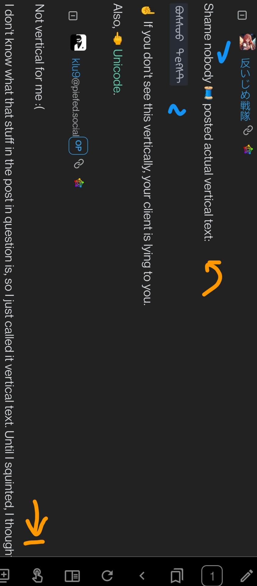
Shame nobody 🧵 posted actual vertical text:
ᠪᠣᠰᠰᠣᠣ ᠲеᠻᠰᠲ☝️ If you don’t see this vertically, your client is lying to you.
Also, 🖕 Unicode.
@AntiBullyRanger @klu9 I would like to see the verticle text in action, where can I load this to see it?
- I have since found out this not actually vertical text but something called Zalgo text, which adds lots of diacritics above and below letters to make the end result very tall. https://en.wikipedia.org/wiki/Zalgo_text
- I haven’t seen actual vertical text on PieFed yet.
I’m honestly at a loss for recommendations. I tried Iceraven, and it didn’t have reading or vertical text mode. Einkbro’s orientation is jarring for LtR language mixed with verticals:
 .
.In portrait mode, it should paragraph leftward. Ideally a 25 character wrap to indent the next line in the paragraph. I’ll try make an html+css example later.
I love all the things unicode support by default but one should not be ashamed to refuse to support some features.
Not vertical for me :(
I don’t know what that stuff in the post in question is, so I just called it vertical text. Until I squinted, I thought it might have been Manchu script :D
Not vertical for me :(
Switch 𐑑 client 𐑞𐑑 1) displays vertical text 2) 𐑯 has recursive font support. 𐑓 Mongolian Bichig, Gecko is recommended. (Not by me). Mongolian White is rec. as well.
Here’s how our exchange should have looked like:

Like others already mentioned 🧵, «Zalgo» is randomized unicode diacritics abuse. If 𐑘𐑹 client escaped 𐑞 diacritics, 𐑘𐑹 font is displaying diacritics correctly.
𐑖𐑱𐑝𐑾𐑯 subs used
Thanks for the info.
TIL about Zalgo text.
People trying to be ‘cool & edgy’ but it really just marks them as annoying idiots. Thanks for the self inflicted Scarlet Letter.
For what other purpose does vertical text exist I ask you.
“Forget your perfect offering. There is a crack, in everything. That’s how the light gets in.”
The typical example given is Japanese text traditionally being written vertically, but I am doubtful that it has any uses in a forum. That’s a bit like claiming that you need cursive fonts because it is traditional in western countries.
Cool way to make zalgo text, kinda.


